Your website is the digital face of your business.
An impressive 97% of consumers go online to find and research businesses.
Source
The very first impression your website makes can make or break your ability to close new business.
Whether you own a local storefront, a yoga studio, or have another type of small business, the quality of your website is a crucial component of your business.
A recent 2021 statistic suggests that your company’s success is depending on it. 75% of consumers judge your credibility based on the design of your website in only 0.05 seconds!
The idea of investing in a professionally designed website may seem daunting for small businesses, especially when you’re faced with tight budgets. Yet, knowing that delivering a good user experience can keep your customers away from your competitors and significantly increase revenue is hard to ignore.
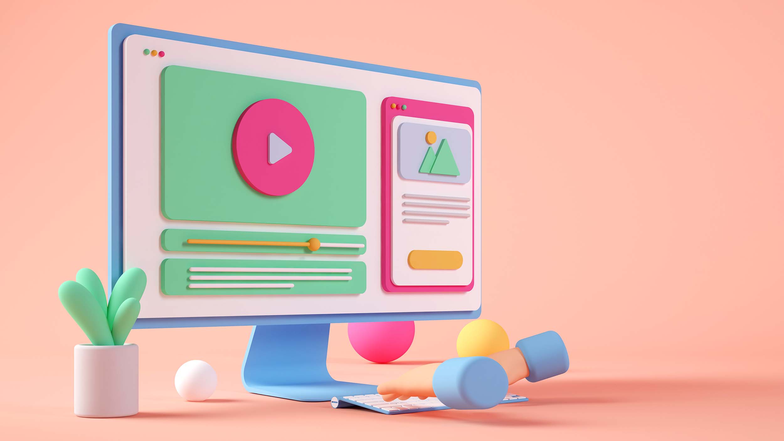
What exactly is web design?
There are 3 main components that make up web design:
- User Experience Design
- User Interface Design
- Search Engine Optimization
User experience design (UX) when done right, goes unnoticed. It is in charge of delivering a smooth digital experience that helps your customer find exactly what they’re looking for with ease.
User interface design refers to your website’s structure, layout and all graphical elements that are being displayed on your web pages. The user interface is the bridge between your content and your customers’ experience. This includes images, icons, typography and usage of colours.
Search engine optimization (SEO) is your site’s appearance in search engines. How easy can your customers find your content through search engines such as Google, Bing and Yahoo? What keywords do they use? Do your headers and URLs have logical structures? Does your website load fast?
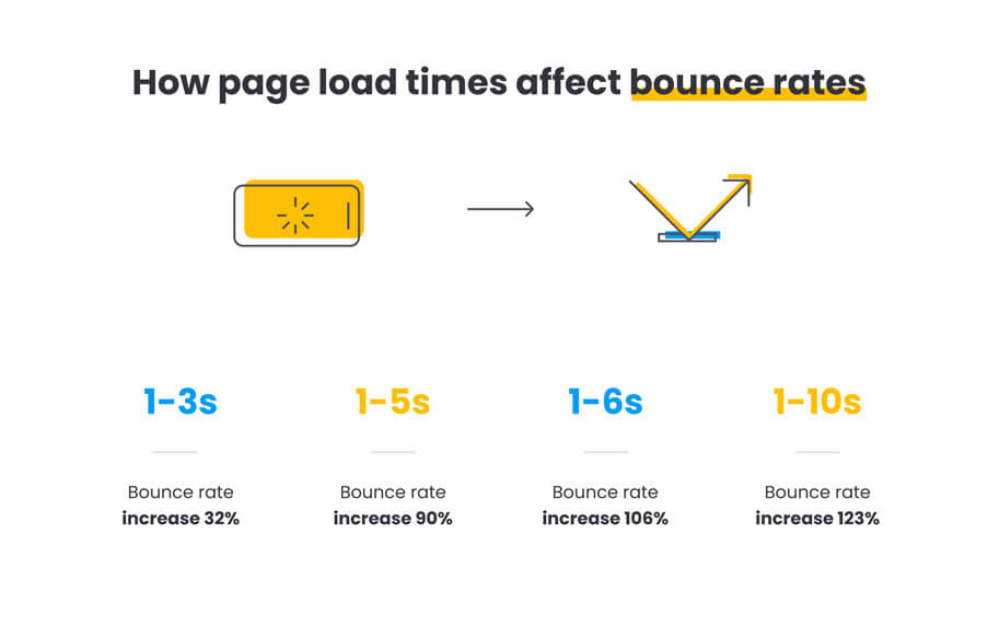
A stunning 47% of users expect a maximum 2 seconds loading time for an average website.
Why you need ‘good’ web design
It sets the first impression
Your website is the digital face of your business. A site that looks plain or old-fashioned sets a negative first impression of your brand.
Compare this with a physical location. If someone walked into your store, wouldn’t you want them to feel welcome?
When customers come to your site, you have only seconds to influence them, and 94% of first impressions are design-related. Customers simply don’t want to check out a business that doesn’t value them enough to make a good first impression.
Your competition is doing it
Your competitors will thank you for having an outdated, generic and low-quality website.
You’ll lose leads to your competitors if they have a more appealing website. They will outrank you in the search engines and potential clients wouldn’t even know you exist.
There is no doubt that having an optimized and professionally design website isn’t a luxury anymore. It is a necessity.
Your site’s design is an opportunity for you to set your business apart from the competition.
Don’t miss this opportunity.
It significantly impacts your bottom line
Various industry studies have stated that every dollar spent on your website’s design brings between $2 and $100 dollars in return.
Your investment will literally pay for itself! We’re currently living in a digitally-led economy and consumers have become increasingly demanding and digitally savvy. No one likes slow websites and often, people leave if loading takes too long.
A recent article shows that a frictionless user experience could potentially increase conversion rates up to 400%.
Source
7 web design principles that will elevate your business
Keep it simple
Don’t let your business model govern your site’s design too much. This is a place to ruthlessly prioritize what you want to display to your customers, not to impress them.
Your main goal is to convert potential customers into paying customers.
And to reach this goal, you need to figure out what the most important information is that you need your customers to take away.
Once you figured this out, you want to present this information in a simple and easy-to-understand way.
This means that overcomplicating your website by adding too many elements, colours, excessive pop-ups and background images will only do more harm to your business than good.
These distractions can cause your conversion rates to plunge.
Solid navigation
It sounds obvious, but it is all too often overlooked. Your customers don’t want to struggle to find information. They want to effortlessly access your navigation bar and be directed to the information they expect.
Your site’s navigation also affects your SEO, traffic and usability. Everything important about your website is connected to your site’s navigation.
Some common mistakes of bad website navigation:
Mistake #1: Non-descriptive or generic labels
Using non-descriptive names for your menu items can prevent customers from finding what they’re looking for.
Solution: Reduce bounce rates (percentage of visitors abandoning your website) by using terminology they are familiar with. This will make them feel confident when navigating your website.
Mistake #2: Non-standard navigations
When your customers’ experience turns into a hide-and-seek game, they are more likely to abandon your site. Don’t reinvent the wheel when it comes to navigations unless it enhances usability.
Solution: Website visitors expect to find a horizontal menu at the top or vertical down the left.
Mistake #3: Overloading your navigation with links
As I mentioned earlier, this is another situation where you should try to ruthlessly prioritize. The more items you place in your navigation, the more you dilute the value of each item.
Solution: Fewer items in your navigation are good for search engines. Try to limit the number of items to 7.
Pro Tip: The “Link Calculator” counts the number of links on any page.
Mistake #4: Using the same navigation for desktop and mobile
Since almost 60% of all internet access is done through mobile phones, visitors expect intuitive mobile navigation. Don’t make the mistake of thinking mobile interaction is the same as desktop interaction.
Solution: Design your navigation with a mobile-first mindset. This could mean hiding the less important items on the mobile navigation.
Designing your navigation doesn’t stop here. A few weeks after creating your navigation, you can use Analytics to look back and do a bit of evaluation.
Ready to attract more customers?
We help brands like yours expand their social reach and attract more qualified leads by crafting marketing campaigns engineered for success. Get in touch with us and start generating results that have a tangible impact on your bottom line.
Schedule a callBrand consistency
Building an online presence isn’t just about getting your name out there. It’s about helping consumers get to know your brand on a personal level.
As consumers, the majority of the purchases we make are emotionally driven rather than practical decisions.
Part of engaging the right emotions with your customers is making them feel like they know your brand and that your brand can be trusted.
Two major components in building trust through your website are consistency and predictability.
To illustrate this, let’s take a look at the following example:
Say, you’re getting to know a person. One day this person uses a bunch of jargon when he/she talks to you while wearing a fancy suit. But the next day this person shows up in shorts, a tank top and uses very plain language when talking to you.
Would you quickly trust this person if you had to do business with him/her🤷🏽♂️?
The company websites below are good examples that reflect brand consistency. Even if you can’t see the logo, you still recognize the distinctive and consistent colour schemes and style of FedEx and Canada Post.
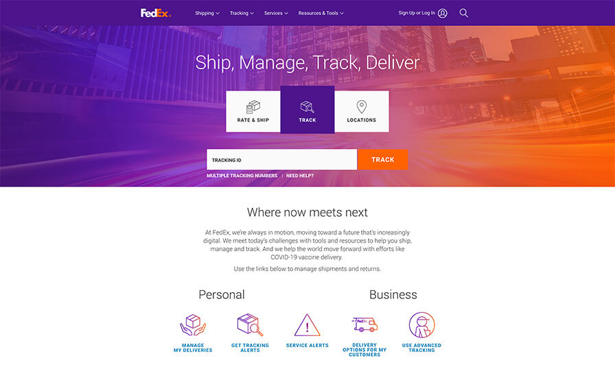
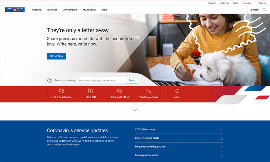
Your website design should reflect your brand and help reassure people who know you that they’re in the right place.
Design for conversion across your website
A conversion simply implies a website visitor performing an action that you intended for them to take on a particular web page. The conversion rate on your website indicates the percentage of visitors taking that desired action.
Designing for conversion looks like a well-thought-out page layout that guides your customer to the most important element on the web page. Most commonly, this is your call-to-action (CTA) button. This button will ultimately convert potential customers into paying customers.
This landing page for freelancers on Upwork is a perfect example of a page that implements the 3 steps I have outlined below to design for conversion.

These 3 steps will help guide to design your pages for conversion:
#1 Colour
The average website visitor only spends 15 seconds reading actual texts and scans through the rest.
If your website predominantly uses white and grey for example, you can use a vibrant yellow or red button for your CTA. This visual hierarchy and contrast will direct your customers’ attention to the most desired element.
#2 Simplicity
Earlier in this article, I mentioned how important it is to prioritize what you display to your customer. This concept of simplicity is an important component in designing for conversion.
A webpage that is boiled down to only essential information does not overload your customer, therefore framing a clear path for them to follow.
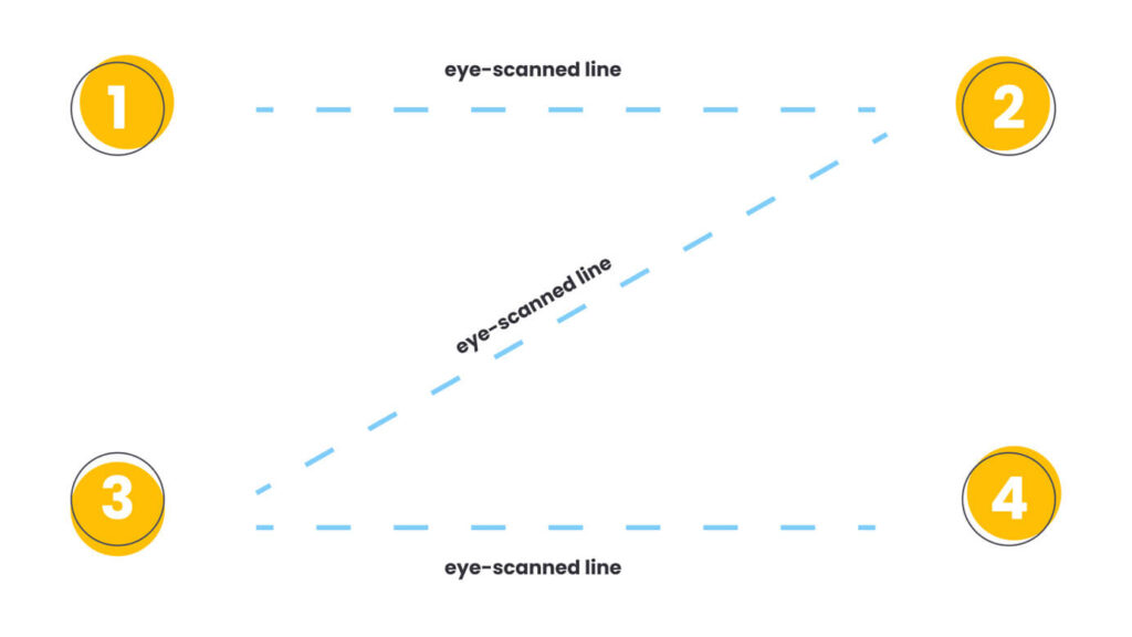
#3 The Z-Pattern
We humans have a natural reading pattern.
- First, people scan from the top left to the top right, forming an imaginary horizontal line
- Next, down and to the left side of the visible page, creating an imaginary diagonal line
- Last, back across to the right again, forming a second horizontal line
Use this insight to your advantage by placing elements strategically following the natural flow of eye-scanning.
Create valuable content
The success of your website is determined primarily by its content.
Ultimately, content wins the wallets of your customers 💰. All other components of your website (design, visuals, videos, etc.) provide a secondary support role.
Search engines love content. So much so, that when you provide content that is relevant, formatted well and valuable, you’ll rank higher in search appearances.
This is content marketing and it helps position you as an expert and allows you to build relationships with your audience.
Here are 2 tips to help you market your content effectively:
#1 Format your content well
It’s often intimidating to read a wall of text that spans across the entire screen without any spacing. Let your customers feel like reading your content is like a fresh breath of air. Make it easy for them to digest your web copy.
Consider using the following elements to break up your text:
- Subheadings
- Bullet points and numbered lists
- Short sentences and paragraphs
- An easy-to-read font family
- Contrast (font sizes, bold text, font colours)
#2 It doesn’t always have to be text
Whenever you can, use illustrations, infographics, diagrams and interactive presentations to explain difficult concepts and assist users in their decisions.
The average website visitor has an attention span of eight seconds and only 28 percent of words are read on an average web page.
Effective design and the usage of visual elements work in harmony with your copy.
It supports your messaging, strengthens it and delivers it in an easy-to-process manner, allowing your customers to connect with your website on a deeper level.
Keep it mobile-friendly
Having your website designed with a mobile-first mindset is not a luxury anymore. As I mentioned earlier, over 60% of websites are being viewed on mobile phones and you can’t afford to ignore this.
With Google now pushing for this mobile-first approach, visitors expect your mobile website design to be as good or even better than the desktop version.
Here are 4 tips to make your website mobile-friendly and drive more traffic:
#1 Include the same content you use in your desktop design on the mobile website
With mobile-first indexing, you want to prevent Google from looking at a site that only has a fraction of your content. Try to make sure that your mobile website design has all the same information, including text, images, and videos.
#2 Optimize for speed on mobile phones
Don’t mistake your website’s desktop speed with mobile speed. These devices render your site differently and it takes more effort to optimize a mobile site for speed. Especially on mobile devices, a large percentage of your customers will abandon (bounce) pages that take too long to load.
#3 Make sure your text is readable on mobile devices
Take a look at your website design on your phone, and verify that the text is large enough to read without zooming in. Also, make sure that the page fits the screen, so you don’t have to scroll sideways to read lines of text.
#4 All interactive elements should be easy to click
On a desktop, we have a very accurate cursor, but on our phones, we use our fingers. Give interactive elements such as buttons extra space so your customers don’t accidentally click the wrong thing.
Pro tip: Put your website to the test using Google’s Mobile-Friendly Test
Invest in Search Engine Optimization
SEO is what brings all aspects of good website design together. Despite the acronym, SEO is as much about people as it is about search engines themselves.
It’s about understanding what people are searching for online, the answers they are seeking, the words they’re using, and the type of content they wish to consume. Knowing the answers to these questions will allow you to connect to the people who are searching online for the solutions you offer.
Ready to attract more customers?
We help brands like yours expand their social reach and attract more qualified leads by crafting marketing campaigns engineered for success. Get in touch with us and start generating results that have a tangible impact on your bottom line.
Schedule a callThe SEO Hierarchy of Needs
Have you ever heard of Maslow’s hierarchy of needs? It is a theory often depicted as hierarchical levels within a pyramid that prioritizes the most fundamental human needs (like air, water, and physical safety) over more advanced needs (like esteem and social belonging).
We created made a similar pyramid to explain the way website design should go about SEO, here is what it looks like:
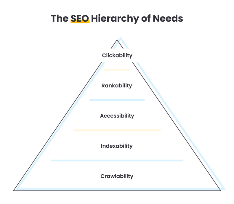
Try to incorporate these 3 basic SEO principles into your website:
#1 Optimize your website for faster loading times
Speed up your website by using lazy-loading (also called on-demand loading.
Lazy-loading is the concept of loading only the required sections and delays the remaining until it is needed by the user. Also, optimize the heck out the images you use to reduce its file size.
#2 Nurture your on-page SEO that helps search engines understand your content
This includes:
- Header tags (H1, H2, H3 …)
- Internal linking (links to other pages on your website)
- Link accessibility (avoid dropdown menu’s, these are often hidden from website crawlers)
- Add schema markup (this is a kind of metadata, referred to as microdata, which gives search engines more information about your content).
#3 An overall good user experience that helps your customer navigate your site with confidence
Will your customers find what they expect when first landing on your website? Does everything work as they expected? Are text and images competing for attention or is there a clear visual hierarchy?
Avoid tricks intended to improve search engine rankings. A useful test is to ask, “Does this help my users? Would I do this if search engines didn’t exist?”
Conclusion
To sum up what we’ve talked about, I created a list for you that you can use to level up your business.
7 principles for good website design
-
Keep it simple
Limit the amount of distractions on your website
-
Solid navigation
Use descriptive names, limit the number of navigation items and position it where your users would expect it to be located
-
Brand consistency
Invoke trust in website visitors by being consistent and predictable
-
Design for conversion
Use colour, page layout and the natural Z-reading pattern to guide visitors to take action
-
Create valuable content
Deliver relevant content, format this well and use visual that work in harmony with your copy
-
Keep it mobile-friendly
Optimize for speed, make text readable, avoid dropdown menu’s and ensure quality interactions
-
Invest in Search Engine Optimization (SEO)
SEO Hierarchy of Needs: Crawlability, Indexability, Accessibility, Rankability and Clickability.
Your website design is one of the most powerful tools your business has to drive results. But in order to do that, it needs a great web design.
While a great website involves much more than just the design, customers want and expect an attractive visual layout. And they’ll judge your business on looks before they read a single word.
If you need help with your website’s design, drop us a line. We are here to help you elevate your business in this digital-led economy!