As a business owner, you have products or services to sell. The first place potential customers go to is the internet. When they land on your website, you only have a few seconds to grab their attention and compel them to take the desired action.
Your business probably already has a website, and it’s aesthetically pleasing to look at. And for the sake of this article, I’m going to assume you have plenty of traffic coming to this site.
However, it doesn’t actually convert enough visitors into paying customers, and it’s hard to pinpoint what is causing this and figure out what steps to take to solve this problem.
Now, designing a website isn’t exactly science, but there are proven formulas that can be used to improve its usability and turn it into an effective sales machine.
In this article, I will show you how to improve your website in only 5 steps! You’ll tweak a few things, and restructure some pages to optimize your conversions!
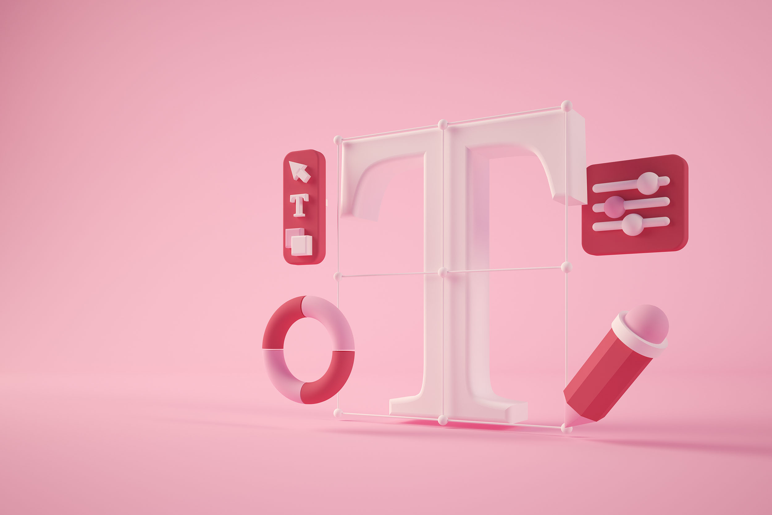
A well designed website should do the heavy-lifting

The difference between a decent and a great website is that your customer does not leave as soon as he lands on your home page. You have piqued his interest, and he’s willing to explore more. That alone will increase your chances of driving more conversions.
From the customer’s perspective, you understand them. You know what they’re going through, and they can quickly see that you potentially have the right solution for them.
Their time is being respected, and they don’t feel like this is a trap. In fact, you might even inspire them about what their future could look like after investing in your product.
The scenario I described above is what a well designed website should do. So how do we turn your website around and accomplish this?
5 steps that will instantly increase your conversions
Lots of research has been conducted by professionals from various industries, like psychology, behavioural science and ergonomics. The result is a formula that helps organize your site to create an effective user experience. This is by no means a one-size-fits-all solution, but they are best practices that’ll guide you in the right direction.
1. The magic formula for your header
The header is the top section of your website. This is the first most important part of a new user’s experience, and should be treated as your top priority.
When a user looks at this, they should be able to answer these 3 questions within 5 seconds or less:
- What do you offer?
- How will this make my life better?
- How and where can I buy this?
This top section of your site should take up no more space than the full height of your monitor. Aim to keep it as simple as possible, and don’t give them the chance to get distracted!
Pair a big head line, subhead line and a call to action button with a meaningful graphic that visualizes your customer’s success.
Help them see into the future and get them excited to buy from you.
2. Strip your navigation to its bare minimum
Do you have more than 4 items in primary navigation? Consider moving some of those items to your footer. I call the footer’s navigation the junk drawer.
You can place every item in there that is not absolutely essential to helping your customer understand why the solution you offer is the solution they need.
If you’re not a SaaS company, mega menus are especially not recommended. These big menus have never been effective in encouraging new users to learn more about your product or service.
Your menu should consist of:
- A small logo on the left
- 1 to 4 supporting links to pages that contribute the most to converting new customers
- An obnoxious call to action button on the right
An undesirable side effect of cluttered navigation is that it takes attention away from the header of your home page. And your header hosts your value proposition. Try your best not to interfere with that.
3. Only have one type of call to action
It’s common that businesses want to present their visitors with an array of call to actions (CTA’s).
You might want them to sign up for a new account, learn more about a service, visit a product page, schedule a call or book a demo. If you’re a non-profit, the goal might be to encourage your visitors to make a donation.
Ideally, you should pick the one that is the main driver behind your conversion. It’s confusing to ask more than one thing from someone new to your website. You end up overwhelming the user and potentially put them in a state of paralysis. When that happens, you lose them. And rather than choosing one option, they will do nothing.
It’s a true conversion killer.
Ready to attract more customers?
We help brands like yours expand their social reach and attract more qualified leads by crafting marketing campaigns engineered for success. Get in touch with us and start generating results that have a tangible impact on your bottom line.
Schedule a callHowever, there is definitely some flexibility when it comes to placing CTA’s. It’s fine to accompany your main CTA with a secondary call to action, perhaps to download an ebook. Just make sure to visually distinguish the two and make the secondary CTA less prominent.
A bonus tip here is to make the text inside your CTA descriptive but short, and surround it with enough whitespace.
4. Invite your customers in on a story

Earlier in this article, I mentioned that a good looking website on its own isn’t going to yield the results a business is looking for.
That beautifully designed website gets visitors past the first split-second decision making stage. The next challenge we’re up against is the story we feed them. Good design goes hand in hand with well written website copy that is clear, concise and goal oriented.
You have to remember here that we’re still at the very first stage of building a relationship with our potential customer, curiosity. They have only just met you, and somewhere in their journey they discovered you might have a solution for a problem they’re experiencing.
To craft this story, we’ll use a seven step framework created by a company I admire a lot, StoryBrand. StoryBrand generously released their framework for us to use, and it makes writing your brand story a breeze.
Answer the following story questions:
- The Character What does your customer, the character in this story, want? Assuming you have done the research and talked to your customers, what is that they desire in relation to your product or service?
- The Problem What is the problem your product or service solves for them?
- The Guide What gives you the credibility to be their guide in this story, and why should they trust you to help them solve this?
- The Plan What are the three or four steps they need to take right now to do business with you?
- The Call to Action What is the call to action that you will use to compel them to take action? This should be clear and directly challenge your customer to enter into your story in which you solve their problem.
- The Successful Ending If they choose to invest in your solution, what will success on the other side look for them? How will their life transform?
- The Failure If they do not buy from you, how will this negatively impact their experience? You are not trying to manipulate anyone here, but you are simply saying how their problem will continue to burden them.
Once you have answers to these questions, you’ll have a strong foundation at your disposal for writing enticing copy.
Every page on your website will have a different purpose. Your about page can be used to build further trust. Your product or sales page should make it very clear how your solution solves their problem, and your blog page is intended to educate readers and position yourself as an authoritative figure.
Write out those goals for each page, and then use the SB framework to craft a story that supports those goals.
5. Construct your homepage like a sales page
If you have written all the answers to the questions from the story framework in the previous step, this one will be a simple plug-and-play.
Just like the header in the first step, there is a proven formula to construct a sales page optimized to effectively convert visitors into buyers. And I’m saying sales page because I believe if you’re primarily selling a product or service, you should treat your homepage as a sales page.
I’m going to lay out a series of page sections that you should insert into your sales page to make buying from you a no-brainer.
1. The Header
This one is obvious, because we just talked about it in the beginning of this article. But I’ll reiterate, this is the top section of your website and is the first thing your visitors will see. It contains a meaningful graphic, big headline, subhead and a clear call to action.
2. The Stakes
The next section should follow the storyline you created earlier. In every story, the character experiences some sort of pain at first. The stakes section spells this pain out for them and makes it clear that there’s a negative experience tied to not solving it. Let them know here that you understand what their pain feels like, and that it doesn’t have to be this way.
Accompany this with a powerful call to action.
3. The Value Proposition
List the primary benefits your solution offers. Don’t make the mistake of listing features, because it doesn’t add anything to the customer’s story that we’ve worked so hard on to create.
The purpose of using benefits is to put your customers in the state of mind where they can see their desired future state.
On some websites, you’ll see a value proposition that consists of multiple sections. Use your own judgement to decide how much detail you need to explain what the benefits are when someone buys from you.
Three benefits squeezed into one section, or each spread on its own. Both are effective.
4. The Guide
Again, you’ll humbly but confidently explain here why they should trust your brand to solve their problem. Maybe you have been there yourself and look at you know, you came out of it better than ever. Or perhaps you can use social proof like testimonials to show that your brand has helped countless people like them.
Whatever you can use to position yourself as a trust worthy and authoritative figure. We’re trying to gain their trust here.
5. The Plan
Now you’ve communicated that you understand the user’s situation, that you have a solution for their problem, and that they can trust you. The next step is to remove ambiguity out of the equation and lay out a step by step plan that makes it easy to understand what the process of doing business with you looks like.
Like I mentioned from the StoryBrand framework, this should be no longer than 3 or 4 steps.
It makes sense that your business has a process that is more complex than 3 or 4 steps, but this is not the place to overwhelm your visitor.
6. The Elaboration
I think this is an optional section that adds to your “Stakes” section. In most cases, your solution solves multiple problems indirectly. I encourage you to use those to strengthen the story you’re telling, because it might just be the extra push a visitor needs to buy from you.
An example could be a productivity tool that doesn’t just solve the problem of wasting time and headaches, but also improves company culture and morale. Or it uses a form of cloud storage and technology that is incredibly power efficient and classifies as a sustainable tech solution.
I don’t know, I’m just making this up as I go, but you get the point.
Conclusion
If you have given these five steps to improve your website a fair chance, I can guarantee it will reflect in your conversions. The best thing about this approach is that it costs you nothing but a bit of your time.
Of course, as a business owner, time is money. If you want an expert to take care of this for you, send us an email!